Original logo sketches

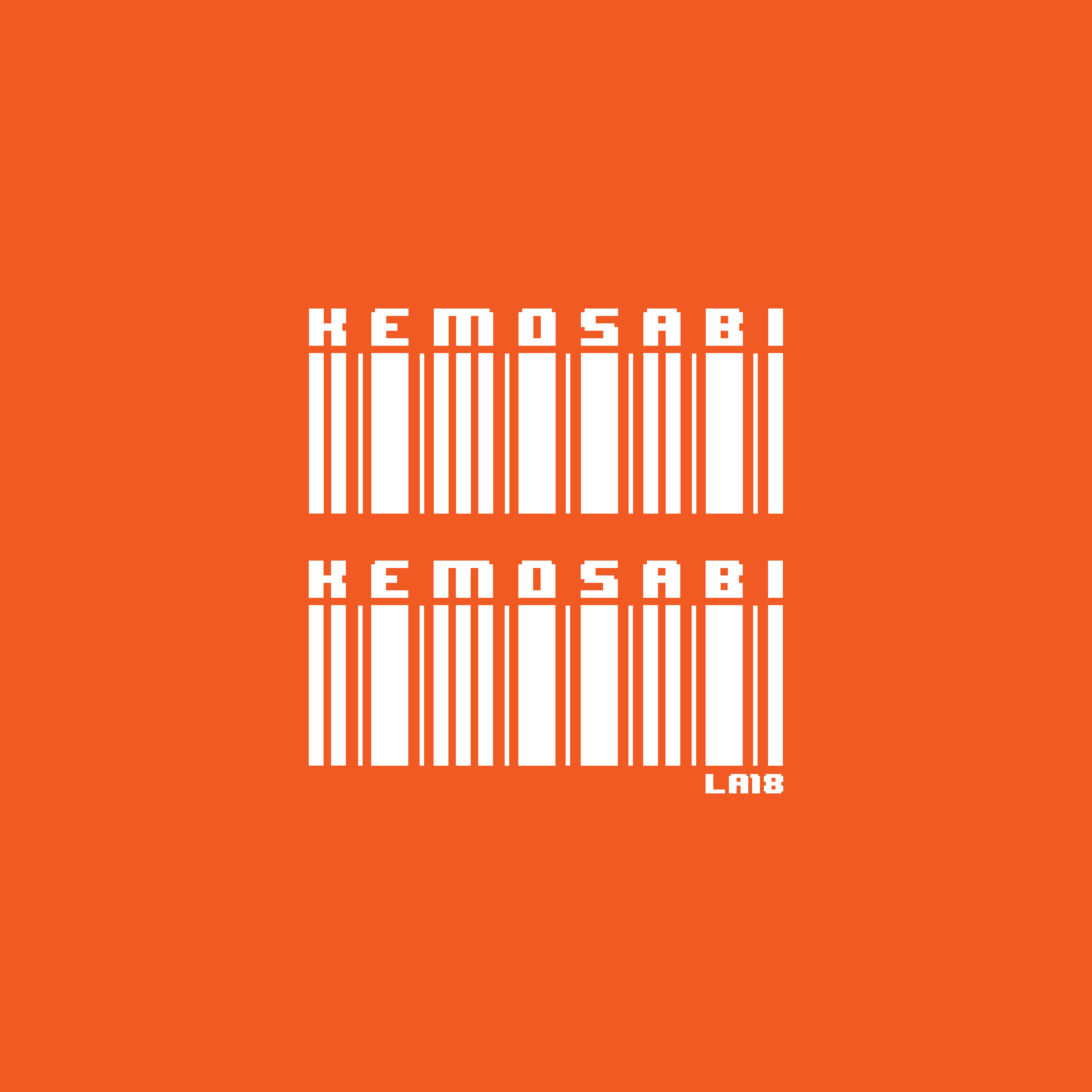
Final logo (orange)

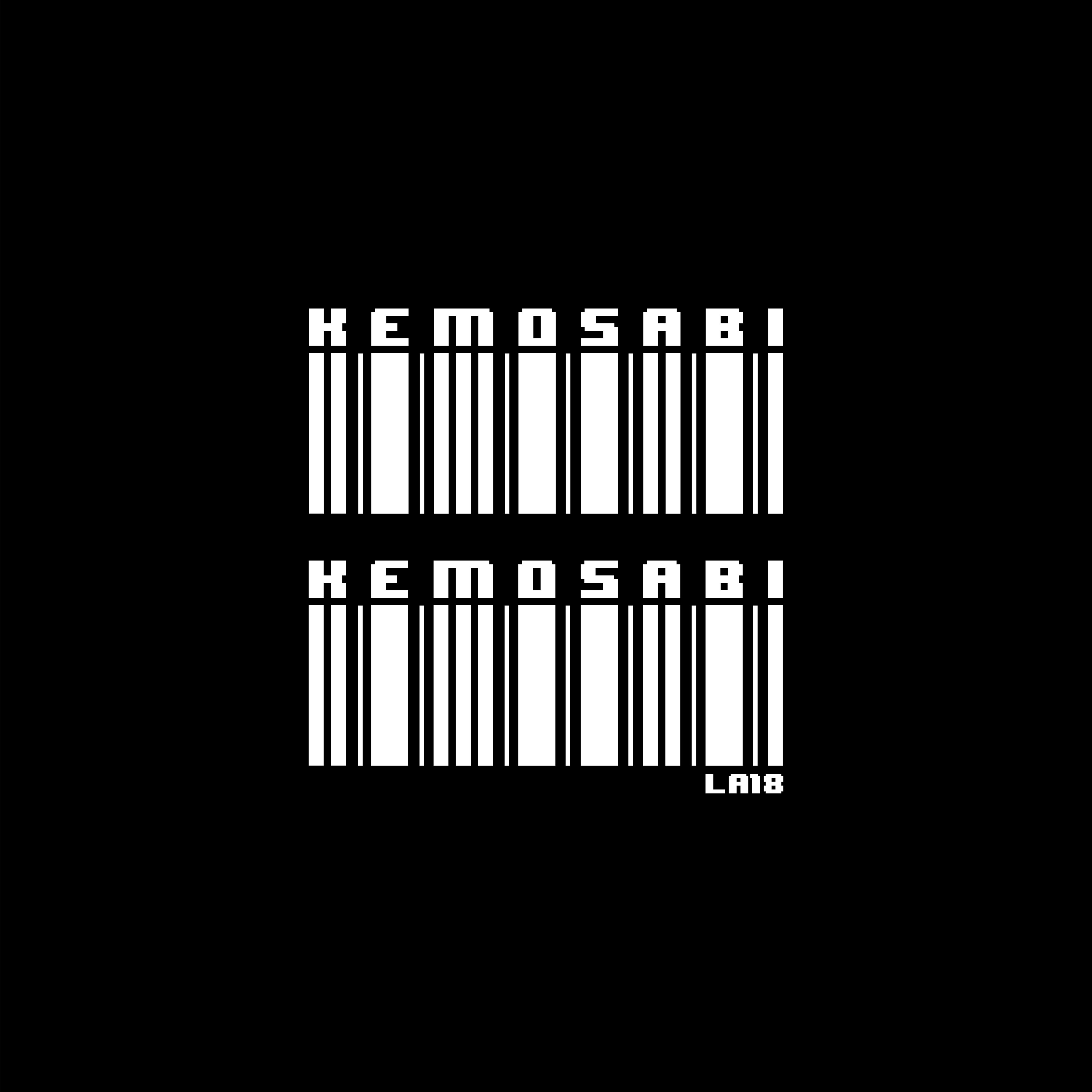
Final logo (black)


Identity/Branding & Social Media Marketing Kemosabi In early 2019, a colleague and I were brought on to create and develop the brand of a local Hip-Hop artist, Kemosabi. Our goal was to build his brand identity and further develop his social media presence. We started by defining who Kemosabi was as an artist and storyboarding visuals that we and the artist felt aligned with his unique sound and message. From this, I was able to design his artist logo, two single covers, and various social media and marketing collaterals. Along with designing various graphics, I accompanied his team on every performance, ensuring proper photo and video footage was captured for future content creation. With my design skills and my colleague's artist management skills, we were able to develop a vibrant brand image for Kemosabi, giving him the platform he needed to further his music career independently. To date, Kemosabi's work can be found on all streaming platforms.
Original logo sketches


